UKUK USUSIndiaIndia

Every Question Helps You Learn

Join Us
Streak
Leading Streak Today 24
Your Streak Today 0
Streak
Leading Streak Today
24
Your Streak Today
0
Geography Skills 02
When would you use a pie chart?

Geography Skills 02

Geography isn't all about maps! During your KS3 geography lessons, you will have realised that you need to do some maths too. A lot of useful and interesting data is presented using tables and charts, for example, lists of the World's longest rivers or the capital cities in order of population. Tables and ordered lists are not necessarily the best way to present all data - it can often help to use some kind of chart. It is an important skill in geography to be able to look at data and decide what is the best way to present it.

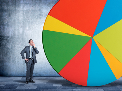
If you have two sets of data that are linked, plotting them on a scatter graph and drawing a line of best fit will help to identify any relationship between them. You need to be able to recognise a positive or negative correlation and whether the relationship is linear or not. If you have a set of data that adds up to one hundred percent, then you could use a pie chart. When drawing any form of chart, use different colours to represent the different types of data.

1.
When should a bar graph be all the same colour?
When the bars all show the same type of data
When the bars show different types of data
When the data increases at regular intervals
When your felt tips have run out
If all data is different then different colours are used
2.
What shows the links between two sets of data?
Block graph
Divided bar graph
Pictograph
Scatter graph
The line of best fit is then used to determine the mathematical relationship between the two data sets
3.
Lines joining places of the same value create what maps?
Batholine
Equiline
Isoline
Microline
e.g. temperatures of various places
4.
What is the most important thing about isolines?
They are always yellow
They must be dotted lines
They must never cross or touch
They will always cross at some point
You never see the isobars (air pressure lines) crossing or touching each other on the weather maps on TV so make sure that if you draw an isoline map, your lines don't cross or touch
5.
Which maps show what an individual person thinks about a particular area?
Bonkers maps
Fantasy maps
Imaginary maps
Mental maps
No two mental maps are the same, as each person's experience of a geographical location is different
6.
Which diagram is best for showing percentages?
Bar chart
Line graph
Pie chart
Scatter graph
The size of each sector of a pie chart is in proportion to the percentage it represents
7.
The line of best fit on a scatter graph showing a linear relationship is always what?
Curved
Horizontal
Straight
Vertical
If the line slopes upwards towards the right, it is a positive relationship and vice-versa
8.
What is the best type of map to show population density in Asia?
Choropleth
Isoline
Mental
Sketch
The differences and similarities between areas are shown by shading them using lighter and darker shades of the same colour
9.
On a pie chart, 1% equals how many degrees?
1.8
2.5
3.2
3.6
Circle = 360° divided by 100% = 3.6 degrees per percentage point
10.
What would best show average rainfall in seven countries?
Bar graph
Flow chart
Line graph
Pie chart
Bar graphs are good for showing amounts of something
You can find more about this topic by visiting BBC Bitesize - Geographical skills

Author:  Jan Crompton

© Copyright 2016-2024 - Education Quizzes
Work Innovate Ltd - Design | Development | Marketing