This GCSE Geography quiz will challenge you on information from data. During your fieldwork, you will be expected to plan and gather data. The data will be a mixture of primary and secondary and you will be required to obtain information from both types of data in order to support your coursework. Also, in the written exams, there will be a number of data based questions. Data takes many forms, it could be the answers to a questionnnaire, a table of measurements taken during fieldwork or obtained from secondary sources, a line graph, bar chart, choropleth map etc. You will need to be able to handle that data, in whatever form it appears, in order to answer the question or complete your fieldwork.
Data questions will sometimes be concerned with information that you can obtain directly from the data or they will be testing your knowledge and understanding of patterns behind the data.
[readmore]
An example of this could be climate charts for different locations in the UK. You could be required to state which location is the driest, which has the highest average temperature or be challenged to suggest possible locations for each place based on your knowledge and understanding of the climate of the UK.
Data could be from any location in the world. A favourite of the examiners is to take data from a location that has not been studied and ask you some questions to test your understanding of geography. When answering questions like that, remember to apply the general principles that you have learnt. Very often, these questions will be about contrasts and similarities between LEDCs and MEDCs, so you should have all the understanding that you need to obtain the required information from the data.
Population pyramids are sometimes used for this type of question - the examiners want to find out what you understand about global population changes and management. You could be given the population pyramid for a small country like Equatorial Guinea, since it is highly unlikely that it will have featured in any of your case studies. The questions would range from simple (e.g. in which age ranges do females outnumber males) to more complex ones such as deciding in what stage of economic development the country is or having to explain the shape of the pyramid. In the latter case, you would need to use your knowledge and understanding of population patterns in MEDCs and LEDCs.
[/readmore]
To see a larger image, click on the picture.
|
1.
|
The graph shows the annual temperature as recorded at a weather station. In which hemisphere is the station located? 
|
|
| [ ] |
Northern |
| [ ] |
Eastern |
| [ ] |
Southern |
| [ ] |
Western |
|
|
|
2.
|
The graph shows the annual temperature as recorded at a weather station. Look at the mean temperature curve. What is the range of the data? 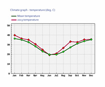
|
|
| [ ] |
16 |
| [ ] |
20 |
| [ ] |
36 |
| [ ] |
40 |
|
|
|
3.
|
Which of the following statements about the graph is incorrect? 
|
|
| [ ] |
2013 was a warmer than average year for the location |
| [ ] |
In 2013, spring temperatures were below average |
| [ ] |
The temperature range in 2013 was 20°C |
| [ ] |
The biggest difference in temperature to the average temperature came in September |
|
|
|
4.
|
Look at the data illustrated for this question. Which of the following are the mean, median and mode in that order? 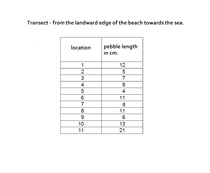
|
|
| [ ] |
17.6, 2, 21 |
| [ ] |
21.2, 5, 12 |
| [ ] |
9.5, 8, 11 |
| [ ] |
9.7, 9, 11 |
|
|
|
5.
|
Look at the data illustrated. What could the geography student do to improve the accuracy and reliability of their data? 
|
|
| [ ] |
Select and record more pebble sizes at each point on the transect |
| [ ] |
Use a larger font for the results |
| [ ] |
Draw a scatter graph with a trend line |
| [ ] |
Choose the largest pebble found within 10 cm of each transect point |
|
|
|
6.
|
Two of the population pyramids in the picture represent LEDCs, they are most likely to be: 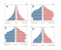
|
|
| [ ] |
A and B |
| [ ] |
B and C |
| [ ] |
C and D |
| [ ] |
A and D |
|
|
|
7.
|
Which of the following statements about the population pyramid of Austria in 2015 is false? 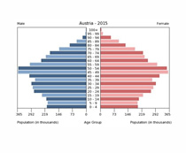
|
|
| [ ] |
Austrian men have a greater life expectancy than women |
| [ ] |
There are more males born than females |
| [ ] |
There are more people in their late 40s than in any other of the age groups |
| [ ] |
This shows that Austria is probably a MEDC |
|
|
|
8.
|
Look at the data presented in the graph. Which of the following statements is NOT false? 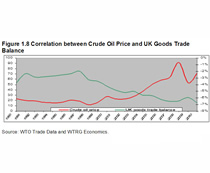
|
|
| [ ] |
There is a positive correlation between the crude oil price and the UK goods trade balance |
| [ ] |
There is a negative correlation between the crude oil price and the UK goods trade balance |
| [ ] |
There is a no correlation between the crude oil price and the UK goods trade balance |
| [ ] |
Between the years 2000 and 2010, crude oil prices and the UK goods trade balance have remained constant |
|
|
|
9.
|
The best way of presenting the data in this table would be (the figures are percentages): 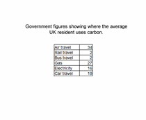
|
|
| [ ] |
as a table |
| [ ] |
as a scatter graph with trend line |
| [ ] |
as a pie chart |
| [ ] |
as a population pyramid |
|
|
|
10.
|
The graph shows how the use of fuels changed over a 20 year period in the USA. How might carbon dioxide emissions have changed? 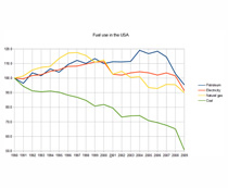
|
|
| [ ] |
The emissions increased |
| [ ] |
The emissions decreased |
| [ ] |
There was no change in the emissions |
| [ ] |
The use of fossil fuels does not have any effect on carbon dioxide emissions |
|
|
|
1.
|
The graph shows the annual temperature as recorded at a weather station. In which hemisphere is the station located?
|
|
| [ ] |
Northern |
| [ ] |
Eastern |
| [x] |
Southern |
| [ ] |
Western |
|
|
|
2.
|
The graph shows the annual temperature as recorded at a weather station. Look at the mean temperature curve. What is the range of the data?
|
|
| [x] |
16 |
| [ ] |
20 |
| [ ] |
36 |
| [ ] |
40 |
|
|
|
3.
|
Which of the following statements about the graph is incorrect?
|
|
| [ ] |
2013 was a warmer than average year for the location |
| [x] |
In 2013, spring temperatures were below average |
| [ ] |
The temperature range in 2013 was 20°C |
| [ ] |
The biggest difference in temperature to the average temperature came in September |
|
|
|
4.
|
Look at the data illustrated for this question. Which of the following are the mean, median and mode in that order?
|
|
| [ ] |
17.6, 2, 21 |
| [ ] |
21.2, 5, 12 |
| [ ] |
9.5, 8, 11 |
| [x] |
9.7, 9, 11 |
|
|
|
5.
|
Look at the data illustrated. What could the geography student do to improve the accuracy and reliability of their data?
|
|
| [x] |
Select and record more pebble sizes at each point on the transect |
| [ ] |
Use a larger font for the results |
| [ ] |
Draw a scatter graph with a trend line |
| [ ] |
Choose the largest pebble found within 10 cm of each transect point |
|
|
|
6.
|
Two of the population pyramids in the picture represent LEDCs, they are most likely to be:
|
|
| [ ] |
A and B |
| [ ] |
B and C |
| [ ] |
C and D |
| [x] |
A and D |
|
|
|
7.
|
Which of the following statements about the population pyramid of Austria in 2015 is false?
|
|
| [x] |
Austrian men have a greater life expectancy than women |
| [ ] |
There are more males born than females |
| [ ] |
There are more people in their late 40s than in any other of the age groups |
| [ ] |
This shows that Austria is probably a MEDC |
|
|
|
8.
|
Look at the data presented in the graph. Which of the following statements is NOT false?
|
|
| [ ] |
There is a positive correlation between the crude oil price and the UK goods trade balance |
| [x] |
There is a negative correlation between the crude oil price and the UK goods trade balance |
| [ ] |
There is a no correlation between the crude oil price and the UK goods trade balance |
| [ ] |
Between the years 2000 and 2010, crude oil prices and the UK goods trade balance have remained constant |
|
|
|
9.
|
The best way of presenting the data in this table would be (the figures are percentages):
|
|
| [ ] |
as a table |
| [ ] |
as a scatter graph with trend line |
| [x] |
as a pie chart |
| [ ] |
as a population pyramid |
|
|
|
10.
|
The graph shows how the use of fuels changed over a 20 year period in the USA. How might carbon dioxide emissions have changed?
|
|
| [ ] |
The emissions increased |
| [x] |
The emissions decreased |
| [ ] |
There was no change in the emissions |
| [ ] |
The use of fossil fuels does not have any effect on carbon dioxide emissions |
|
|