| 1. |
What kind of chart might you use to show the different eye colours in the class? 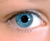
|
||||||||
|
| 2. |
Which colour has the highest value in this bar chart? 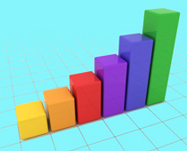
|
||||||||
|
| 3. |
This graph shows favourite colours in a class. What was the least favourite colour? 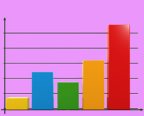
|
||||||||
|
| 4. |
Sam measured himself every month for a year and wrote his results in a table. What would you expect to see? 
|
||||||||
|
| 5. |
How much has been tallied here? 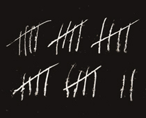
|
||||||||
|
| 6. |
The teacher tallied the quality of homework handed in by her class. How many children handed in 'Good' or 'Excellent' homework? 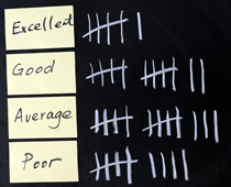
|
||||||||
|
| 7. |
Zak wants to ask his friends about their favourite TV programmes. How could he organise the information? 
|
||||||||
|
| 8. |
Sam is struggling to read his bar chart. He has labelled the numbers at the side, but what else should he have done? 
|
||||||||
|
| 9. |
This pie chart shows the colours of swimming costumes in a class. What is the most popular colour? 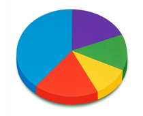
|
||||||||
|
| 10. |
When we look at tables, graphs and tallying, it is called... 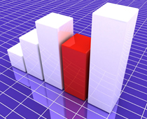
|
||||||||
|