


Ask the AI Tutor
Need help with Level 7-8 Data Handling - Making Connections? Ask our AI Tutor!
AI Tutor - Lucy
Connecting with Tutor...
Please wait while we establish connection
What relationship is likely to be shown if ice cream sales are plotted against daily temperatures?
Level 7-8 Data Handling - Making Connections
Make sense of connections in data. Learn correlation, scatter graphs and lines of best fit to describe, compare and predict in real KS3 contexts.
1 .
Tony wants to test his theory that the weather affects tourism. This sort of theory is called a .......
hypocaust
hypothermia
hypothesis
hypothetical
Scientific theories begin life as hypotheses
2 .
The correlation of sea water temperatures plotted on a scattergraph against the number of bathers is .......
positive
negative
not likely to provide much information about bathers
unreliable for making predictions about bathers
The warmer the water, the more people will go swimming
3 .
A scattergraph of rainfall against numbers of people on the beach shows negative correlation indicating that .......
rain makes the sea colder
rain puts people off using the beach
swimmers don't like getting wet
the tide is higher after rain
Not many people visit the beach when it's raining
4 .
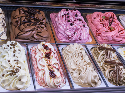
What relationship is likely to be shown if ice cream sales are plotted against daily temperatures?
Fewer ice creams are sold when it's raining
More ice creams are sold in hot weather
Most ice creams are bought by children
Vanilla is the most popular flavour
Only one of the four possible answers mentions temperature
5 .
Time spent in a games arcade is recorded in categories 'up to 10 minutes', 'up to 20 minutes' etc. What sort of diagram is used to illustrate this data?
Box and whisker diagram
Cumulative frequency graph
Frequency polygon
Scattergraph
Times of 'up to 10 mins' are included in 'up to 20 mins' so the figures are cumulative
6 .
The steepest part of the cumulative frequency graph represents .......
the most typical range of times
the greatest range of times
the longest time
the average time
Cumulative frequency (CF) is always recorded on the vertical axis
7 .
Tony recorded the games arcade times of 400 people. His estimate for the average time from the CF graph is .......
the sum of all the times divided by 400
the most popular time
the CF value on the curve at the halfway point of the time axis
the time value on the curve at the halfway point of the CF axis
This is an estimate for the median time
8 .
The times corresponding to 100 and 300 on the CF axis are called the lower and upper .......
qualities
quantities
quarters
quartiles
The difference between these values is called the Inter Quartile Range (IQR)
9 .
What proportion of the data is represented by the IQR?
The middle 25%
The top 25%
The bottom 50%
The middle 50%
The median is at the middle quartile
10 .
Tony is at a seaside holiday resort. If he plots slot machine takings on a scattergraph against rainfall he is likely to find that .......
the line of best fit has a positive gradient
the points fit a perfect straight line
the rain has no effect on takings
there is no correlation
Some people play the arcade games even in good weather but more will play to get out of the rain


**Unlimited Quizzes Await You! 🚀**
Hey there, quiz champ! 🌟 You've already tackled today's free questions.
Ready for more?
Ready for more?
🔓 Unlock UNLIMITED Quizzes and challenge yourself every day. But that's
not all...
not all...
🔥 As a Subscriber you can join our thrilling "Daily Streak" against other
quizzers. Try to win a coveted spot on our Hall of Fame Page.
quizzers. Try to win a coveted spot on our Hall of Fame Page.
Don't miss out! Join us now and keep the fun rolling. 🎉
**Unlimited Quizzes Await You! 🚀**
Hey there, quiz champ! 🌟 You've already tackled today's free questions. Ready for more?
🔓 Unlock UNLIMITED Quizzes and challenge yourself every day. But that's not all...
🔥 As a Subscriber you can join our thrilling "Daily Streak" against other quizzers. Try to win a coveted spot on our Hall of Fame Page.
Don't miss out! Join us now and keep the fun rolling. 🎉
© Copyright 2016-2026 - Education Quizzes
Work Innovate Ltd - Design | Development |
Marketing