UKUK USUSIndiaIndia

Every Question Helps You Learn

Join Us
Streak
Leading Streak Today 4
Your Streak Today 0
Streak
Leading Streak Today
4
Your Streak Today
0
Unit 4 - Appropriate Chart/Graph
Why are charts and graphs used to present data? Find out in this quiz!

Unit 4 - Appropriate Chart/Graph

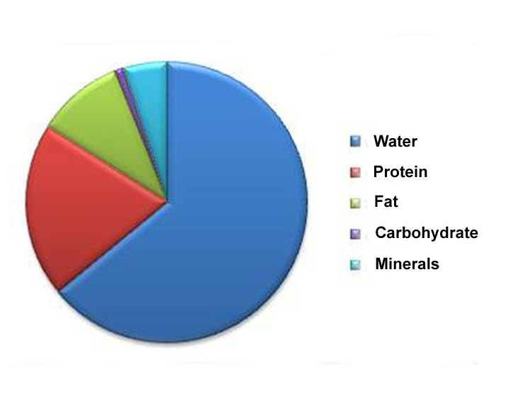
In this GCSE Biology quiz we look at some of the many types of graphs and charts and find out how to choose the appropriate one to present different types of data. Scatter graphs, pie charts and bar charts are examples of some of the different ways used by scientists to present their data. It isn't always easy to know which one to use in which situation but if you learn a few simple 'rules', you will find it a lot easier. It all comes down to what type of data you need to present and what information you want from the data.

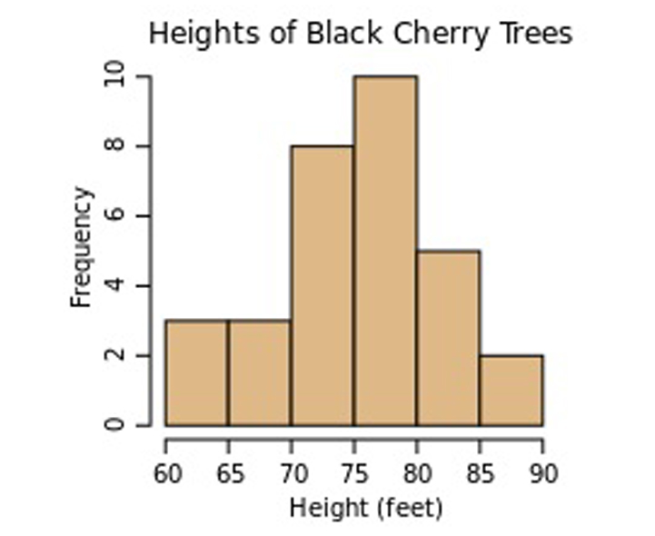
Raw data is the data that you obtain from an experiment, for example, you may have a list of the numbers of people in your class who can and cannot roll their tongues; the list of results is the raw data. Once you have your raw data, you need to decide on its type and how it is to be used. In some cases, you may just want to present the results of a survey but in other cases, you may want to use it to make predictions or to spot patterns.

Continuous data is data that contains units of measurement that can have any value. Examples of this are cm (and other measurements of length), temperature, volts and amps. Take cm for instance, you are not just limited to 1 cm, 2 cm, and so on - you could have any value - 1.25, 3.9, 625.29853 and so on. This type of data is often used to make predictions, for example, predicting the current through a resistor at a voltage that you haven't measured.

Discrete (also called discontinuous) data is data that contains only specific values. Examples of this would be the tongue rolling data (can roll their tongue or can't roll their tongue are the only two possible values) or eye colour. This data needs to be presented differently and can only be used to make vague predictions. For example, using tongue rolling data from your class to predict how many people in the whole school can and can't roll their tongues would only be approximate as the data depends on genetics which are random.

Line graphs and histograms are appropriate when presenting continuous data. You would use a line graph where points can be joined and a histogram where you are presenting a range of data against a specific variable, e.g. an age range against height. If you need to find a correlation between two sets of data, you would use a scatter graph with a line of best fit. Discrete data can be presented as bar charts and data consisting of percentages which total 100% can be shown as pie charts. It may also be appropriate to present data as pictograms but that is much less common in scientific subjects than in other subjects.

Please click on any of the smaller images below to get a larger picture.
1.
Identify this type of chart.
Line graph
Bar chart
Histogram
Scatter graph
You can join the points in a line. Hence line graph
2.
Looking at this histogram of the height of cherry trees, why is this a histogram and not a bar chart?
Photograph courtesy of Jtneill at Wikimedia Commons
Height is continuous data
Height is discontinuous data
The data is averaged
The data is accurate
Discontinuous data is presented in a bar chart
3.
In the following pie chart, which has the largest percentage?
Photograph courtesy of Optigan13 at Wikimedia Commons
MSM
MSF
IDU
Other
Pie charts are great for showing percentages
4.
Using this pie chart, showing the composition of the human body, which of the following is the body mainly made of?
Photograph courtesy of JenCom at Wikimedia Commons
Protein
Fat
Carbohydrate
Water
All humans are about 70% water!
5.
This shows the population of a country as time goes on. The population is...
increasing
decreasing
the same
increasing and decreasing
It is drawn as a line graph because the population is known at any given time
6.
Looking at this line graph covering a 12-hour period, which hour shows the highest amount?
3
5
7
11
Line graphs usually have a jagged appearance
7.
Points just plotted without joining or bars is known as a ...
scatter graph
line graph
pie chart
bar chart
Scatter graphs are useful for spotting patterns in data
8.
What sort of chart is this?
Pie chart
Line graph
Bar chart
Scatter graph
Each bar is a different group of data
9.
This chart is a type of...
bar chart
line graph
mean
data
In a true bar chart, there is a gap between each bar but you would not be penalised for missing out the gap in an exam or coursework
10.
This is an example of which type of chart?
Line graph
Histogram
Bar chart
Pie chart
Looks like the pieces of a pie! Each piece represents a percentage of the pie. Half of the pie would be 50%
You can find more about this topic by visiting BBC Bitesize - Practical skills

Author:  Donna Maria Davidson

© Copyright 2016-2024 - Education Quizzes
Work Innovate Ltd - Design | Development | Marketing