


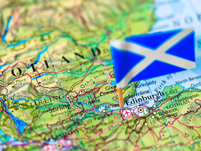
Information from Maps
This GCSE quiz looks at information from maps. Maps are central to geography! It is therefore essential that you are able to gather information from them. A map is a representation of part of the surface of the Earth, but it can contain a huge amount of data. The simplest kind of map is a sketch map. A sketch map is generally not drawn to scale and conveys only a small amount of information e.g. it could show the roads that someone needs to follow in order to get to a particular location. During fieldwork, a geographer may use a sketch map to note the position of certain features e.g. along a stream or river, which will help them later in their study.
Accurate maps are produced by cartographers. They use specialised equipment to make their measurements. In the early days of map making, these measurements were not as accurate as they are now, so some of the oldest maps can look quite strange to our eyes.
Maps of coastlines that were produced by the early explorers look vaguely like the real coastlines, but noticeably different to the accurate charts of today. The information they contained was relevant to the explorers such as possible places where they could go ashore, where they had encountered unfriendly indigenous people and so on.
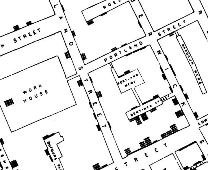
As the science of mapmaking developed, map scales became increasingly accurate and cartographers used symbols to represent features of the landscape, buildings and so on. This allowed more information to be carried by a map, for example, maps of local parishes showing what land belonged to which person as well as the local tracks, paths, streams and other features were developed.
During the eighteenth century, the idea of drawing lines to join points of equal value became more widespread. By the end of the century, European maps with lines joining points of equal height were starting to appear. These were called contour lines and we take them for granted on modern maps.
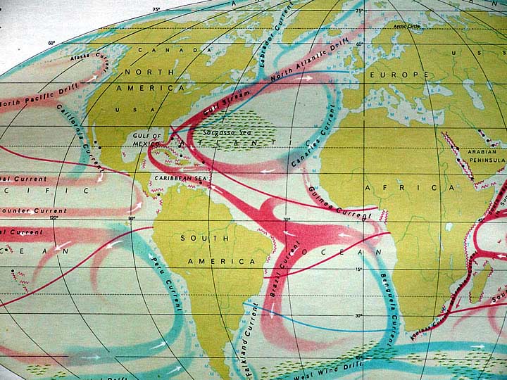
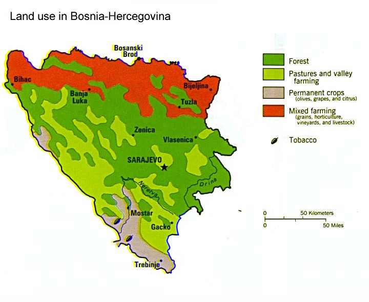
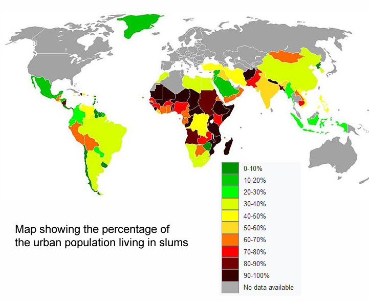
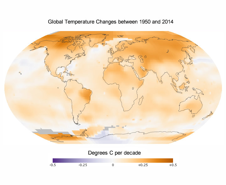
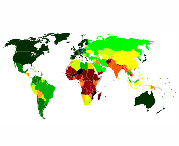
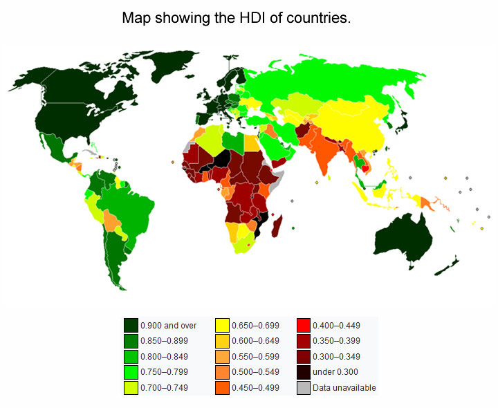
Some of these old maps still exist and are a good source of information for geographers studying changes to the landscape over a period of time. In atlases, the use of maps was further developed and maps contained a wide variety of different information such as ocean currents, climate zones, population densities, agricultural and political zones and more.


Ready for more?
not all...
quizzers. Try to win a coveted spot on our Hall of Fame Page.
Here To Help
Our Social Circles
© Copyright 2016-2024 - Education Quizzes
Work Innovate Ltd - Design | Development | Marketing