


 AI Tutor - Lucy
Line Graphs and Tally Charts
Line Graphs
Your child will be expected to interpret line graphs. Graphs which show temperature across time are a particular favourite as they will allow a line to go into the negative sector. It is unlikely that there will be any expectation to draw a graph in an entrance test although your child should be able to do so regardless.
Line graphs display information in a visual way and are useful to show trends and allow people to extrapolate further information.
As an example, let's see what the following line graph can tell us:
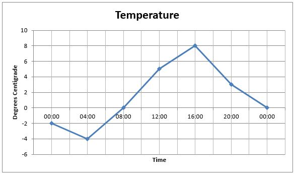
Firstly, let's check the vocabulary of the line graph. The 'x-axis' is the horizontal line where the times are written on our graph. The 'y-axis' is the vertical line on which the temperature is displayed on our graph.
The temperature at the start of the day is read by dropping down from the '00:00' (midnight) figure and stopping at the point where the line is. Move across to the left and read the value on the y-axis so the temperature at midnight was -2 degrees Centigrade. Later, at 04:00, (four in the morning) the blue line has dropped to -4 degrees Centigrade so that is the recorded temperature at that time.
Questions would revolve around reading directly from the graph, as we have just done, or interpreting where the line is at an intermediate point. For example, 'What does the graph suggest the temperature was at 02:00?'
Because there is no reading from this time, we must assume the temperature moved in a linear way, dropping in a regular way between 00:00 and 04:00. As 02:00 is at the halfway point between those two times, we simply find the halfway point between the two on the x-axis and drop down to the point where the line is. Move straight to the left until you meet the y-axis and read off the value of -3 degrees Centigrade. This is the required answer.
Tally Charts
Tally charts are the precursor to bar charts and are the method children are shown to prepare for compiling them. In an entrance test there may be some tally chart questions which require a child to read information or use the details to compile a bar chart.
Let's look at how the tally chart can be created and how to use the information.
Imagine a child wants to know the day of birth of the members of their class. This is information that can be quickly collected and easily collated as a tally chart. Every time a child is asked and provides an answer, a single line is written in the relevant box on the tally chart. For ease of counting, every fifth line is a diagonal going through the previous four; these numbers are then added up ('tallied') and the number written under the 'frequency' heading. These numbers can then be used to create a bar chart to show the information visually.
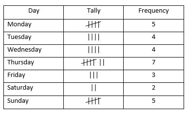
If you are asked to explain how many more children were born on a Thursday than a Friday, you simply look at the frequency for the two days and, taking one from the other, give the difference. In this case, there were (7 - 3) FOUR more children born on a Thursday than a Friday.
When deciding which criteria to use for a tally chart, encourage your child to choose sensible options. If collecting ages, there's no point in asking a class of 10-year-olds how old they are. Similarly, there's little point in forming a tally chart if you ask what people's favourite food is and get no more than one or two people choosing each option. Questions may get your child to assess the suitability of a tally chart for a particular task.
© Copyright 2016-2026 - Education Quizzes
Work Innovate Ltd - Design | Development |
Marketing