


 AI Tutor - Lucy
Bar Charts and Pie Charts
Bar Charts
Bar charts are the natural progression from a tally chart. They take information collated and show it in a visual form which allows people to see trends easily. Line graphs can, in some cases, be presented as bar charts but it is normal to use line graphs with time while bar charts deal with discrete information with finite limits.
Let's look at the information collated on the tally chart which was used as an example earlier:
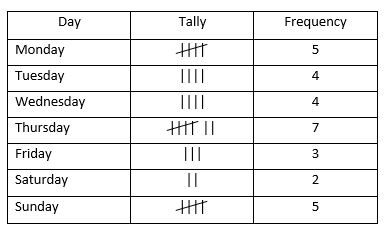
The chart shows the day of the week on which children in a class were born. The bar chart to show this information would look like this:
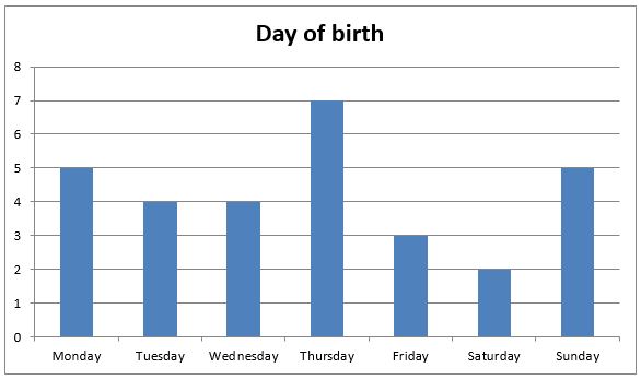
The bars make the figures much more visual but are essentially identical to the tally chart.
A question you might get based on this bar chart is 'How many of the children were born at the weekend?'
The days of the weekend are Saturday and Sunday therefore the total number of children born on those days is made by adding the two figures. However, unlike the tally chart, you can't simply read off the numbers; you need to follow the horizontal lines from the top of the bars and read off the figure on the 'y-axis'. Saturday's figure is 2, Sunday's figure is 5, therefore the total of the two days is 7 children.
Your child may also be asked to show how many children were asked for the survey (all the daily totals added together) or how many more or less were born on one day rather than another (simple take-away sum).
Pie Charts
A pie chart is a common sight in sales documents and other places but is not the easiest of things to create. It is based on the idea of a circle, which is 360 degrees, and the sharing out of these degrees according to the proportion of the whole which fits some certain criteria. For example, if half the group fitted into one category, that would be shown by half the circle, or 180 degrees of it.
Pie charts may show the same information as a bar chart but they are not any use showing time against another thing, as a line graph shows.
Returning to the information which we used in the bar chart, the pie chart created would look like this:
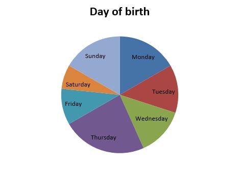
This is a regular and easily-compared format but isn't so easy to create or to read numerical data from. The angle created for each section has to be worked out by establishing the fraction it forms of the whole, then multiplying it by 360. For instance, thirty children were asked about their day of birth and five were born on a Monday. The angle is therefore 5/30 x 360° = 60°. It is unlikely children will have to do this in the pressure of an entrance test.
Most questions will involve estimating numbers from a chart or being given percentages for the figures and the pie chart becomes a subsidiary element to the question.
For example, if a section of the pie chart appears to be taking up a quarter of it, the child may be asked to say how many it represents. Should 100 people have been surveyed, 25 would be represented by the quarter of the circle.
© Copyright 2016-2026 - Education Quizzes
Work Innovate Ltd - Design | Development |
Marketing